

Designing GiveEasy from Scratch
Making it easy for nonprofits to create online donation pages.
Company:
GiveEasy,
fundraising software
Role:
Senior Product Designer,
part-time freelance
Team:
CEO, Marketing Manager,
4 Devs, 2 Engineer Managers
Timeframe:
16 months
Scenario:
GiveEasy's 9-year-old platform struggled to keep up with competitors due to outdated technology, leading to market share losses. The CEO spent 40% of his time resolving platform issues, while engineers implemented frequent manual fixes.
Challange:
Despite strong customer service, the company faced 10% annual churn due to a poor user experience and confusing interface. The legacy platform had a fixed, static layout design that users couldn't easily customise or tweak.
Results:
I was brought on to redesign the platform from scratch. I design a simple, yet dynamic, donation page builder with intuitive interfaces to retain and attract customers.
I discovered that GiveEasy needed to cater to simple and advanced user preferences. Both user types wanted the flexibility to give them unique ownership of the digital space.
Customer satisfaction ratings increased by 110%
Customer retention rate
increased by 8%
In-product feedback aligned updates with user needs
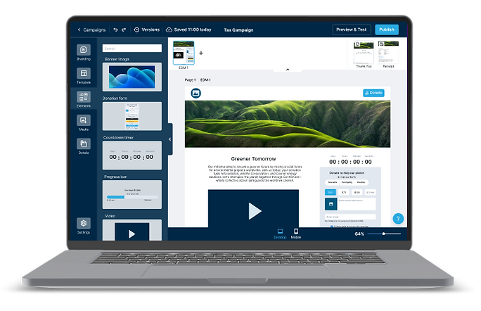
Final designs: Click through Figma designs to create a new campaign on GiveEasy 2.0

You are new to GiveEasy and ready to set up your first campaign.
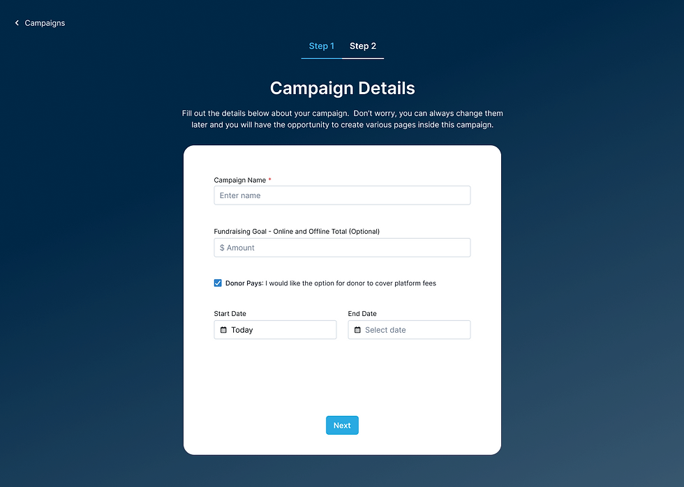
You enter in your tax campaign details.

You dig deeper into the data. You may make a few tweaks to your campaign to ensure your charity hits their campaign goals by the end of financial year.
You are new to GiveEasy and ready to set up your first campaign.
The Journey
Desk & competitor research, competitor review, user interviews, survey
Ideation, prioritisation, How Might We (HMW) statements, user personas
Wireframes, user feedback, stakholder & engineering feedback
Hi-fi Figma designs, design reviews, usability testing, satisfaction survey
Discover:
Building Empathy
I immersed myself in the current platform to experience first-hand what it’s like for users to design an online donation page. It didn’t take long to feel their frustration—overlapping buttons, invisible updates on mobile view, no way to undo actions, and inflexible page layouts. The list of issues seemed endless.

GiveEasy legacy platform
Industry & User Knowledge
I dedicated the first month to thoroughly learning about the fundraising industry, its competitors, and the different users. This involved:
Competitor Review
I analysed competitors to identify strengths, weaknesses, opportunities, and threats (SWOT) which led to a new site map architecture, product offering comparison, ideas for the new UI, and opportunities for GiveEasy to stand out.

User Interviews
I spoke to current customers, prospects, & churned accounts which revealed valuable insights into their internal campaign creation processes, critical pain points, and platform problem areas.
"The current platform isn't forgiving and not idiot proof" - Josie, Agency
"We couldn't have more than one page and had to update frequently to meet the needs of giving day campaigns" - Alex, Nonprofit
Survey
Surveys helped validate assumptions, highlighted preferred editing tools, and clarified user preferences. This feedback was essential for making informed design decisions and it also highlighted the need to balance competing priorities in the MVP.
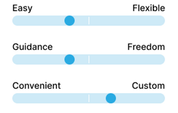
Users want a platform that's...
Define:
I identified a combination of macro and micro problems that were addressed during the design phase. For example:
Macro: Site map architecture issues
Nonprofits constantly tailor their donation pages to different donor audiences across multiple media, resulting in many disconnected donation pages that don’t connect to an umbrella campaign.
Micro: Talioring the mobile experience
Users can't customise the mobile experience and preview before publishing.
But the key issue identified to help GiveEasy stay competitive and reduce churn was:
Simple & advanced users need the flexibility to create online donation pages that align with their unique brand & marketing requirements; but the current platform's fixed, static layout limits their ability.
Meet the Archetypes


How might we balance the needs of both the simple and advanced user types?
Solution: Dynamic, Drag & Drop Editor
I created a centralised campaign editor that allows nonprofits to create out-of-the-box or custom online donation pages, with consistent branding and tailored donor messaging.
Some ideas that contributed to this solution include:
Unified templates & saved sections
To quickly create a donation page without starting from scratch.
Donation element aggregation settings
To easily manage and customise donation elements.
Company branding
Ensuring each page aligns with the nonprofit’s brand identity.
Custom fields and merge tags
Allowing personalised and dynamic content tailored to different donor audiences.

The video shows how you can create an online donation using a template and make adjustments according to unique needs.
Honing in on the Priority Items
I put on my product manager hat and sat with the owner and lead engineer to define the MVP and prioritise features. As I began listing must-have existing features and should-have new ones, the list quickly grew—the enthusiastic owner wanted to include everything imaginable to make the platform exceptional.
I explained the need to prioritise to get the product to customers quickly for testing and feedback. Emphasising that focusing on the MVP was crucial for saving time and money, I worked with the owner to narrow the scope and focus on what truly mattered.
“Arielle's product management skills stood out as she guided us in prioritising features, teaching me a lot about how a MVP approach benefits our business and customers." - Jeremy, CEO
Design:
Balancing the needs of both user types was a top priority.
I took inspiration from creation sites our users loved, such as Canva, and used familiar drag-and-drop patterns and click-to-edit sites. I also ensured the interface and interactions were easier to use than our competition to give us a competitive advantage.
I explored these concepts in sketches and wireframes to communicate ideas early to engineers, stakeholders, and customers.

Experimenting with campaign page navigation and high level buttons

Exploring interactions for adding, removing and duplicating pages. Also how to name pages and group them in them in the future.

I decided this space would be best used for advanced settings such as padding, margin, and read more functionality.
Experimenting with campaign page navigation and high level buttons
User the arrows to view early GiveEasy 2.0 concepts and commentary
Validation: User Testing & Feedback
After aligning the team on the high-level vision through the wireframes and gathering early feedback, we saw excitement building during moderated usability testing sessions.
“Wow, this is night and day compared to the old, current platform...
The new one is so clean and user-friendly!” - Drew, Agency
I identified major and minor issues: moving the branding step from the campaign creation stage to inside the editor, allowing users to see how their branding decisions would apply to their campaigns in real-time.

Iteration 1: Branding inside the create a campaign steps

Iteration 2: Branding inside the editor
Deliver:
From Chaos to Clarity:
Like any start-up, things can feel unorganised. To bring order to the chaos, I established a structured design review process with dedicated Slack channels and video walkthroughs for early engineering feedback. I meticulously annotated Figma screens with logic and scenario details for clarity.
To optimise my time, I recommended a detail-oriented marketing colleague to join the product team, enhancing development reviews, quality assurance, and Jira ticketing. This streamlined workflows and ensured high-quality outputs.

Annoated Figma screen for the mobile experience. This was also
accompanied with a video walkthrough of the entire flow.
Figma Fantasies to Real-World Realities
The engineers worked remarkably fast, and we started to have a live editor!
I organised live usability testing sessions, where we could observe our customers taking our newly improved donation page editor for a spin. In these sessions, we “failed fast” and made further enhancements, such as improving the drag-and-drop interactions and giving them advanced settings to manage spacing & padding.


Moderated usability testing with the live platform
Centralised Feedback Streamlined Issue Resolution
During MVP onboarding, the owner faced a flood of direct emails about customer questions and bugs, shared ad hoc via Slack or email. I proposed a centralised feedback system using platform-embedded forms, automating data collection to a Monday board to streamline trend analysis, prioritise customer-centric solutions, and save the owner time.
As a result, we improved response efficiency, enhanced user experience, and provided valuable insights to align feature development with customer needs.

Monday.com customer feedback hub

Embedded Monday form inside platform
Developed Version: Sneak Peak!
GiveEasy 2.0 is about to be launched to all customers. So far the new platform’s intuitive interface and seamless experience boosted customer satisfaction by 110% and increased retention by 8%, including retaining a major client. Nonprofits praised its ease of use, reducing churn risk and enhancing overall adoption.
There are still features and improvements to come! 🚀

Reflection:
Advocating for a Design System
Starting a design library was an important first step, but without engineering resources, it couldn't evolve into a full design system. While this was a limitation, advocating for its importance early laid the groundwork for future improvements. When the time is right, the foundation is ready to streamline design and development processes.

A glimpse into the GiveEasy design library I crafted to enhance design speed and ensure platform-wide consistency, built on a third-party library foundation.